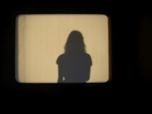
This year's poster is a graphic, seemingly simple piece, designed by Óscar Mariné Brandi. He owns a design firm out of Madrid, and he is well known for his branding work with Camper, Loewe, and Absolut Vodka. Communication is a key part of his design thought process, uniting content and context. And making it look really, really good.

You name it, he's done it: posters for Pedro Almodovar, layouts for El País, branding for cultural centers, everything! All his designs bear his fingerprint, a bare and unapologetically hip purposefulness with a tiny pinch of play.
Óscar Mariné and his design group also designed last year's set of posters for the festival.

At this point, I actually prefer last year's main poster. In an interview in Diario Vasco, Mariné says, "The posters have to be polemic...Last year's was polemic because there was pink, because there was wood." And the poster did seem to invoke a little controversy, with the references to Basque culture settled starkly against a very modern color and design sensibility.
This year's, he says, "can please many people because it has many colors and each one can be seen reflected in another." Meh. A bit freshman art school (the explanation, not the design). He goes on, "It's a potent, very clear poster with a very direct, positive message. That before the [economic] crisis, we have to have the attitude of lending a hand and pushing."


